This page has id 143

White pyramid orchid, Standlake, 2010.
The first picture is fixed; i.e. it does not scroll with the rest of the page. Interestingly, as you can see, it floats below the menu bar, but above everything else on the page. It’s position is 200px down from the top and 5px in from the left. The picture is shown with a caption, which adds the large outer container. The container has a greenish-grey drop-shadow applied via the wp-caption class. (The widget boxes in the sidebar had the drop-shadow applied using the widget-wrapper class)The photo itself has a 6 pixel border and a black outline. These, the centering and the caption, were added via the Add Media wizard. Neither the photo nor the caption box have rounded corners.
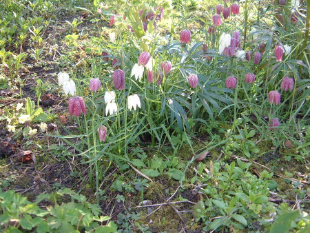
This second photo of some fritillaries has rounded corners, of radius 5 pixels. This has been set as the default for images. Here the drop-shadow was applied using the drshadow class and is a shade of grey. Alignment was set at “none” in the Add Media wizard
When an image is added using the Add Media wizard, it will by default be linked to the image file in the library. This means you can click on the image to see it on a separate page at its original size. Making it clickable can just be distracting, in my opinion, but useful if you are only showing a very small version in the page.
Pictures act like inline elements, so a picture does not start on a new line like a block element would. If it is of the same vertical dimension as the text, it will flow right along with the text.
You can also centre them like text by using text-align:center in the opening tag for the element that contains the image (not the img tag itself). Here is an example:
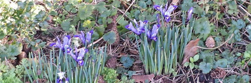
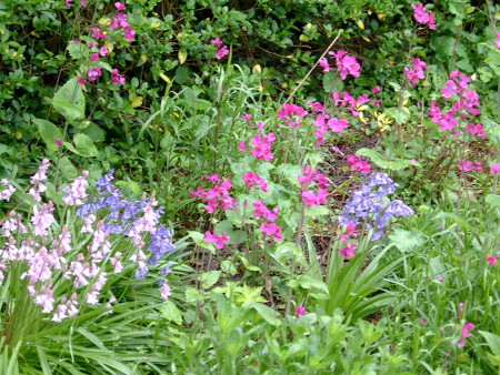
Spring flowers at Willow Tree Cottage
However, this method of centering is frowned upon, as it may not work in all browsers. Here instead, I use a class called “centre” applied only to images:
I centred the caption separately from the image using CSS.
As you can see, these images are not links (an image can be used as a link to anything, just as text can). No size was specified for this image, so it is displayed at its “natural” size. Width, height or both (but to preserve aspect ratio, just specify one) can be set in the img tag in pixels (but don’t include units!) or as a percentage of the containing element. Note that the height of a containing element is usually undefined, so using a % makes no sense for height.
Both of the following work equally well for setting the size of an image; the first uses html and the second uses inline CSS:
Aligning two images side by side is not that easy! See tab on tables and columns for some options
 Here the image is “floating” to the left of this text. The image size has been set at 30% of the containing element, which is the paragraph. I also needed to add a margin to the image as by default the text would appear right up next to it. Below I am going to add another paragraph with the same image, this time floating to the right of the text. This is a great feature but you have to be a bit careful what happens at the borders between successive images an text blocks, for example, if there is not enough text to fill all the space next to the image, before the next image. I will demonstrate this further down. It is important to look at it in different browsers too!
Here the image is “floating” to the right of this text. The image size has been set at 30% of the containing element, which is the paragraph. I also needed to add a margin to the image as by default the text would appear right up next to it. Here I am going to clear the float instruction, so that the images and text below only start below the bottom of this image, instead of next to it
In this case there is only a very small amount of text to the right of this image and we can see what happens if the float is not cleared.
Both images were surrounded by opening and closing paragraph tags, which forced a one line gap between the two text segments.
As with most things, it can be more convenient to create classes for things like certain image sizes and positions, if they are going to be used repeatedly on a site.
The image map used below was made using GIMP: filters/web/image map to define the different areas of the image which are linked to various other pages etc. It is important that this image is sized before making the map so that it will be the same size when displayed. Otherwise the clickable areas no longer match up as planned. Surely there must be some solution to this as it must be a problem for small screens?
Image file types
jpeg/jpg (Joint Photographics Experts Group): These are suitable for photographs where the resolution does not need to be too high and a small file size is required. They are not suitable for images with text, large blocks of a single colour or straight-sided shapes. This format does not preserve transparency.
png (Portable Network Graphics): These are suitable for photographs where the file size can be a little larger and high resolution is important. They can be used for images with a transparent background. Suitable for logos and large blocks of a single colour. This format (png-24) does preserve transparency.
gif (Graphical Interchange Format): These are useful for simple images: banners, buttons, etc., where small file size is very important. 256 colours. gif files do preserve transparency. Do not use for photos.
It is very worthwhile to have good discipline when naming image files which you upload to the media gallery; you can save a lot of time if you can recognize the file you are looking for without opening it. Rules to follow:
- Use lowercase characters
- Do not use any spaces as this may lead to urls which don’t work. Use the minus sign instead if desired
- Use a descriptive title, e,g, “bluebells125x125.jpg” or “primroses-125×125.gif
- Keep well-organized copies of your images (with identical names to those in the media library) in a directory on your computer
“Subversion” is an open source version control system which can be used for large projects with many people working on them.
Image file size
The larger the file size, the longer it takes to load. It is recommended to try and keep image files to less than 100KB (reminder to self: strictly speaking kB means 1000B, while KB means 1024B!)
The canvas tag
From Wikipedia: “Canvas consists of a drawable region defined in HTML code with height and width attributes. JavaScript code may access the area through a full set of drawing functions similar to those of other common 2D APIs, thus allowing for dynamically generated graphics. Some anticipated uses of canvas include building graphs, animations, games, and image composition.”
The photos on these pages were taken by us; in general no images should be used unless permission is specifically given. There are a couple of website to help you find images that are copyright free and allowed to be used anywhere. e.g. http://search.creativecommons.org/
and http://www.adigitaldreamer.com/gallery/index.php. The latter is sorted by topic and has some good textures, in particular.
Embedded documents as a way to display images
For scanned documents with text, a good way to display the image is to save it as a .pdf file and then embed this file in the page. The file can be quite small and still have very good resolution. The embedded document window can appear very different in different browsers and for different browser screen magnifications (for large magnification with Chrome the box can even appear blank/black, so the user should be made aware that trying some different settings may be required. This method is not very well suited for access using small-screen devices. The magnification settings within the embedded document image can also affect how it appears. Below is an example where this method was very useful in reproducing a 30+ year old document very well, with a small file size. Here I have left the height setting out and it is necessary to scroll down the embedded document to see the whole thing. In another case I tried to pick the correct height so that this would not be necessary but obviously it is not possible to find a height which works for all magnification settings. As well as all of these other settings, the theme, page template, etc being used on the website can affect how well this method works.